Blog

Keep updated with HAD-PRINT

No hiding… honesty is one of our values

We often get asked to competitively pitch on projects. And occasionally we say no, we’re not going to quote when we see what we’re against. We don’t do race to the bottom. However recently we’ve had feedback from an end user who showed us what was advertised and what they got. The original specification sheet and the supplied polo shirt were nowhere near a match.

What we do…

  • Our garment proposal sheets, feature clear positionals and photos of the proposed garments.
  • We only specify garments we know and trust.
  • We provide honest advice on what will work in different print and embellishment methods – some are better than others at different things.
  • Honest charging and can suggest the right breakpoints to achieve cost performance points.
  • We provide options to enhance the end-user experience – tagging and bagging or packing.

So, with the case study above, we’d ensure that a heavier-weight garment was specified to match the end user’s environment. It also takes a detailed print better. The proposed garment had opportunities for further trimming or embellishment to add value to the merchandise proposition.  We would offer an option for branded tagging, if you wanted an end-user experience to be delivered more “branded” we can recommend easily branded pain packaging to deliver within a cost budget. This packaging can also be nearly plastic-free for better environmental credentials.

If you are in a specific sector, we understand that your market audience has expectations. A good example of this is motorsport, where attention to detail, and specification of the performance vehicles is matched by the specification and detail of the apparel used. Whether two-tone garments, garments with colour panels, or piped trim, detail in print and embroidery is absolutely critical.

Part of our service is the fact we spend considerable time getting to know the products we use. Whether this is getting touchy-feely at trade shows and roadshows, getting samples in and putting them to the physical test.

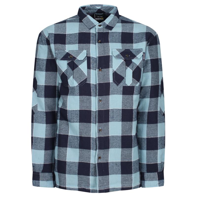
Talking of physical tests… in the last year, we’ve rejected 2 items on our testing programme. These include workwear boots, which were inconsistently manufactured and the product support through wholesale and distribution didn’t match our expectations. The other was a Hoodie, which bobbled on after the second wash.

The crux is, if you value your brand, doing the right thing sometimes takes a bit of a bottle. If you are doing merchandise, think about the sales journey, reviews, product evaluations, and user-generated content is now major selling points. If you go on a race to the bottom and don’t have honest sales collateral you will get adverse responses from your valued customers, audience, followers or the better description for them – stakeholders.

The hidden difference in good print.

So, you’re about to invest in some print-based marketing to help you achieve some physical touch points with your customers. However, you’re looking at the budget and thinking, well I can save some wedge here… Wrong! For anyone with an ounce of common sense, this article won’t be a shocker. It’s the old adage of what goes in adds up to the net result. It always surprises us, when people want absolute top-notch results, and provide artwork for print from the likes of Canva or Publisher. Ask any good professional, and the answer will come back as a resounding Adobe CS suite, in particular, for page layout Indesign and Illustrator. Let’s unpack why…

Downsides of Canva or Publisher…

  • • Dubious standards of PDF creation within these applications. Adobe invented PDF and when written to the right standards, no issues with fonts behaving differently, colour spaces (or ICC profiles) which reflect the end result are properly curated into the PDF
  • • Let’s touch on it, both of the two applications mentioned above, don’t have a fine pedigree with nicely finessed typography. The Adobe CS suite maximises the features within OTF (Open Type Fonts), which provides exceptional tracking information on the spacing between characters and utilises the ligatures properly within the additional characters that exist in OTF fonts. Also remember that Adobe was the creator of Postscript fonts in the first place, so the pedigree is there again.
  • • Colour management starts well before the creation of a PDF for print. How colour is handled whether it is RGB or CMYK (best for print) or other colour spaces. Adobe has influenced and set standards for colour management since the 1990s at the start of desktop publishing.
  • • The tools within PDF creation for print within these applications are very limited, again Adobe CS suite makes bleed and trim marks effortless, without any forethought.

So, the other downside of the tale is when someone has all the tools and doesn’t know how to use them. Yes, you can have Adobe CS suite, however, knowing how things work goes a long way.

  • • Image preparation – finessing the detail, and knowing how you make the right technical tweaks can go a long way from average to stunning. We’ve retouched images which needed detail carefully added back in, getting the tonal balance right, and understanding the limitations of the print process for highlights and shadows. Within recent history, it was known to have specialists for this job to maximise the results from scanned transparencies to produce results which were crisper than sharp and visually said wow on the page.
  • • Accept that certain items like logos should be vector-based artwork; such as .eps .ai .svg and certain types of .pdf – a vector graphic is a mathematical format which describes key points on the outline and tells where to fill with colour or what stroke width to apply. Why are these great; they scale and remain sharp at whatever size you use them. No raggy edges from bitmap raster-based formats which don’t scale.
  • • Without sounding old, the art of good typography is dead. Back when I was a junior in graphic design studios, senior designers would issue substantive scorn on poorly tracked, kerned characters in typeset copy. The text should flow and connect with good spacing which aids the reader to enjoy reading said textual copy. Again Adobe CS suite allows this to be handled with ease. (also add in Quark Xpress for anyone still using it!)

Design your page for how it is going to be produced, I was taught about designing for the medium of production. Unfortunately, these days aesthetics override considerations of the HOW. We use to have to consider when designing a brand of communications how they were going to be produced. Silk Screen print was still big in the 1990s for large format billboard advertising, limitations of entry-level small format litho printing were totally different from commercial colour litho, however, the entry cost points also reflected this. Designing to meet these criteria along with the client’s budget and also maximising the result.

We can instantly pull out a piece of artwork, which we know has been artworked up properly (or pukka as we say) – it stands out as effortless, it just works. We can always identify the artwork (even before we’ve looked at the metadata on the file which tells us how it originated) which just has small tell-tale giveaways. We know when we see a file from MS Publisher, colour space will be an issue, the colour will shift from corporate colours in RGB (Microsoft’s default colour space) to CMYK, fonts will look uncomfortable on the page, and yes, we’ve seen horrific things to type from Publisher, with additional strokes to embolden beyond Black or ExtraBold fonts.
Equally, we know that the definitions on PDF files from Canva are dubious, with it struggling to define the Art Box / Bleed Box / Trim Box / Media Box / Crop Box’s within the page description in the PDF file – sorry very technical there. PS Canva isn’t big on colour management either.

So as with anything fine in life, the result you get boils down to the quality of what you put in. I will accept over time perhaps the dreaded Canva might get better, however, initial impressions are very limited. So if you’re specifying for print with good results, think about the how, – how it is created, how it is going produced as a physical item, this will affect some thinking. Equally, don’t ask a web design agency to artwork your print… we don’t get involved in web online stuff, as we are professionals in print. Good artwork/design people for print, have decades of working in the environment and knowing how materials will handle different ink coverages. A good print designer / artworker will make very good suggestions when specifying what paper stocks and finishing processes to enhance the end result to maximise the result in line with the design and artwork.

So, why this blog now, we’ve seen some shockers over the past few weeks, call it therapy, if we don’t walk about it, we’ll just get grumpy. So, if you want stunning print, ask us at the beginning. It’s our trade, we’re not agency wallers pumping it to an internet shed, production is on-site, real live for us – real pukka print.

King of the hoodies!

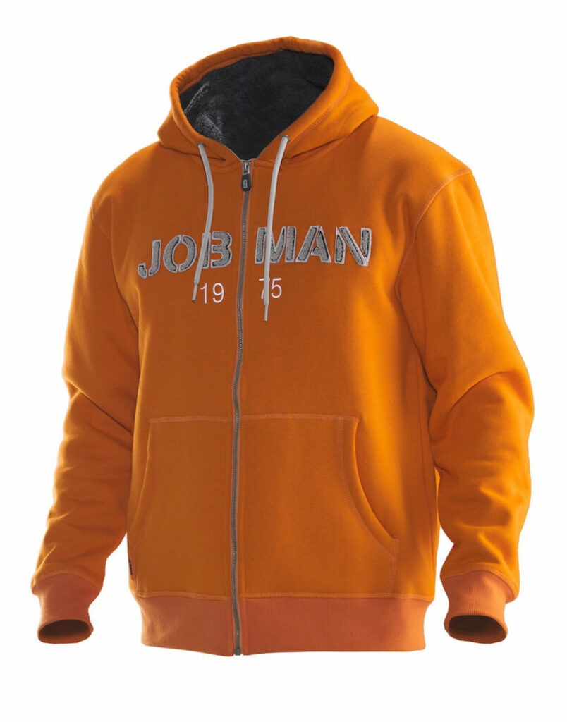
Probably the most requested item in any apparel range is the Hoodie. They’ve evolved so much over the last few decades, styling comes and goes, and equally “trend” colours shift on an annual basis too. But they’re well and truly a staple of the apparel mix. Corporates now adopt them for team wear, they appear as an easy means for work-from-home branding, and above all there functional.

Where did they stem from? Well if you go back far enough it’s the monks, that were the first adopters of the hood in everyday apparel. More for functional purposes than style. Hoods keep the warmth in and are so relevant to today’s cost of living issues. Yes, hoodies have had it rough, the 1990s associated them with yob culture. As we said, the flavour has changed.

So with the plethora of options now available how do you start?

With the likes of Just Hoods by AWDis with over 75 colours, the choice is massive. The generic college is the starting point. Also, AWDis have an excellent choice of varsity hoods, with the 2 colour combinations. So the sky is the limit when it comes to colour options.

The next option people ask for is something more weighty. The standard hoodie weight is 260-280gms material, so the next level is 300-310gms weight. In our opinion there are two options AWDis have a heavyweight option, note not with the same range of colours. Also, the other option is Anthem’s heavyweight – we seriously like these, the trim and finishing level on these. Yes, we can get other options around this, however, the finish or quality doesn’t match the two options.

If you’re running an event and need hoodies on a budget, we’d recommend Ultimate Clothing Co, a 260-270gms weight garment, with a limited colour range, but it prints great and delivers a product you can be proud of within a budget.

All of the above can be found in our showroom, so pop in if you want to get your hands on them and decided for yourself!

So if you are planning to style up a hoodie for a merchandise project, here’s the low down on how to manage this from stock to something different;

  • • consider the cords, yes you can often upgrade these to match your print colour or other styling facet
  • • hood prints, you really need to get the garment and work out what can appear where, as hood panels do vary from garment to garment style.
  • • if zipped, you can look at zip pullers, there are options to trim these to make them look funkier.

If in doubt, ask, between us here at HAD-Print we live our hoodies, we’ve tried many different options, and we know what we like. We listen to our customers and pick up what works, even when it is family members who are envious at people’s hoodies!


Our Group Of Companies

        Office Equipment Solution  •   Business IT Services  •  Bespoke Print Solutions   •   Technology Repair Services


    We challenge change. We source solutions. We evolve together.


© 2013 - HAD-GROUP.  All rights reserved.