Blog

Keep updated with HAD-PRINT

Cutting corners doesn’t pay…

I know I’ve written blogs around the topics of design, useful tips and quality of reproduction before. But this seems to raise its head frequently and needless to say, things don’t change. The adage of what goes in is what comes out. Whether it be mail merge data, which hasn’t been prepared correctly, or the consistency is random; flyers that are produced without any thought to the target audience or how they will be engaged with are just a few of the many challenges to great results. The small nuances are the finer detail which is all part of what we do. Some might say it’s the 80/20 rule, but of course, it’s the last 20% that makes the difference.

So here are a few thoughts regardless of what your project is…

Planning

Failing to plan is planning to fail as the adage goes. Print is a pivotal point in a marketing cycle, being scattergun with it doesn’t help you. Having a production plan, including textual copy reviews, branding coherence, ensuring imagery is spot on, now’t worse than text saying one thing and your imagery speaking the opposite.

Know your audience

Absolutely critical, mapping this out will provide you with the key approaches to ensuring you successfully engage your decision-makers. This pen portrait will ensure you know who you are “talking to”

Use your budget wisely

This is where your 80/20 rule shows the most. Cutting corners can do more damage than the difference in the saving. Good design artwork doesn’t have to cost the earth. Good printers have experienced designers in-house. If part of something more critical, a graphic designer will add more flair to a larger project. Rule of thumb, design/artwork studio time within a print house will be £25-£35 p/hr whereas creative designers will be £40-£75 p/hr. Getting your design/artwork right will drive the results, so this is money well spent.

Ensure great reproduction

When a printer has been involved with a job from the start, if they have a good background with traditional “repro” as it was called, they will optimise images to ensure great reproduction. Or as one client called it “Sows Ear into Silk Purse”. See the blog on the Lost Art of Repro

Print has never been as affordable

True fact, print comparatively is more affordable than it was 10-20 years ago. So don’t try haggling, you just rub the printer up the wrong way. The advent of digital print has reduced the cost of entry. However, set up fees; disk/file handling charges still apply, as it still requires someone to get your file ready for print. The downside of short-run print (small quantities) is that finishing set up costs for lamination, foiling, creasing, folding and other bindery work.

Working with a good print provider will help you to control your project costs, they will suggest ways to ensure you can measure the performance of your printed item. Printers are real-world people, with significant experience of working across media to ensure integration. Yes, you can ship your file to a big internet shed, have it squirted through a machine, and we know the chances of total satisfaction won’t be as high, a local printer does a lot more than you probably realise, above all they are human, and love engaging with people like you.

Proofing perfection – get it right first time.

Once upon a time (well that sounds like a children’s story), the process of “proofing” was a critical process of producing an item for print. We are in changing times, and every penny counts in a budget, so a costly mistake can be the last thing you need. In a day and age, where online content is always updated and evolves, sloppiness creeps in. A piece of printed collateral will have a longer life span than a piece of digital content.

It may seem like there is never time to proof something thoroughly the first time, but when it is not done, you may end up making time to do the entire job a second time. Just what are some of the things that should be checked during the proofing process? Here is a list to perfect your proofing strategy:

Proof the textual content.

The first place to start is the text. Review all text for spelling and grammatical correctness, check punctuation, and most importantly, the accuracy of the content. One of my early bosses encouraged us to read the text backwards, so read it properly, then go to the end of the paragraph and check every word. If you have written the text and revised it copiously, get a second pair of eyes to be your critical friend and read it. Good editors/copywriters don’t charge too much for this service.

Check the image quality.

Image quality expectations change vastly with different types, colour is a critical item as well. What might view ok on your computer screen, could reproduce differently in print. An experienced pre-press technician or digital printer will guide you through ensure modest colour management. They will ensure calibration from screen to print and different paper stocks. Worth noting that a screen uses subtractive colour (RGB) and we print using an additive process (CMYK) so colours will vary. For high-level image quality jobs, it may be wise to have physical proof rather than just an on-screen proof, as digital printers, we can proof your job on the paper stock. Or provide benchmarking for colour with standardized materials.

Confirm the overall look and feel.

Pages can look very different on screen to when they are printed. Look over the typography, and the quality of reproduction, ensure you are happy with the detail. Ensure placement of images, illustrations and text. Don’t forget to check hyphenation and line arrangement (as us about Widows and Orphans), page format, and bleeds.

Whilst the print process has dramatically reduced in its timelines, the proofing process is something which you cannot afford to reduce. It is the difference between making a modest impression or an excellent impression with your reader.

The lost art of repro

Our Stuart unpacks some of the traditional knowledge when applied to digital print, really packs some punch in creating stunning results.

In an age not that long ago, there was a rare breed of skilled craftsman called Repro Technicians. Usually found in something called Repro Houses, or Prepress departments in reputable print businesses. They had a unique skill set, high-level understanding of colour, making the printed image sharp, understanding the magic of half-tone screens and many more mystical things print-related. They were masters of ensuring that that was given to the press operators allowed them to produce top-notch results on press. A classic case of quality materials provided is indicative of quality out.

As technology evolved, Repro Technicians also did evolve. Grasping colour scanning, this was substantially more than your desktop scanner. With equipment which was tuned with fine optical lenses and sophisticated electronics, this produced results which were often tailored to “High-End Repro”. This entailed ensuring good reproduction in the shadows and highlights, correct colour balancing, bringing out detail in mid-tones, sharpening and lots more finessing of quality photographic images to deliver exceptional results. This knowledge is still applicable even in a totally digital environment.

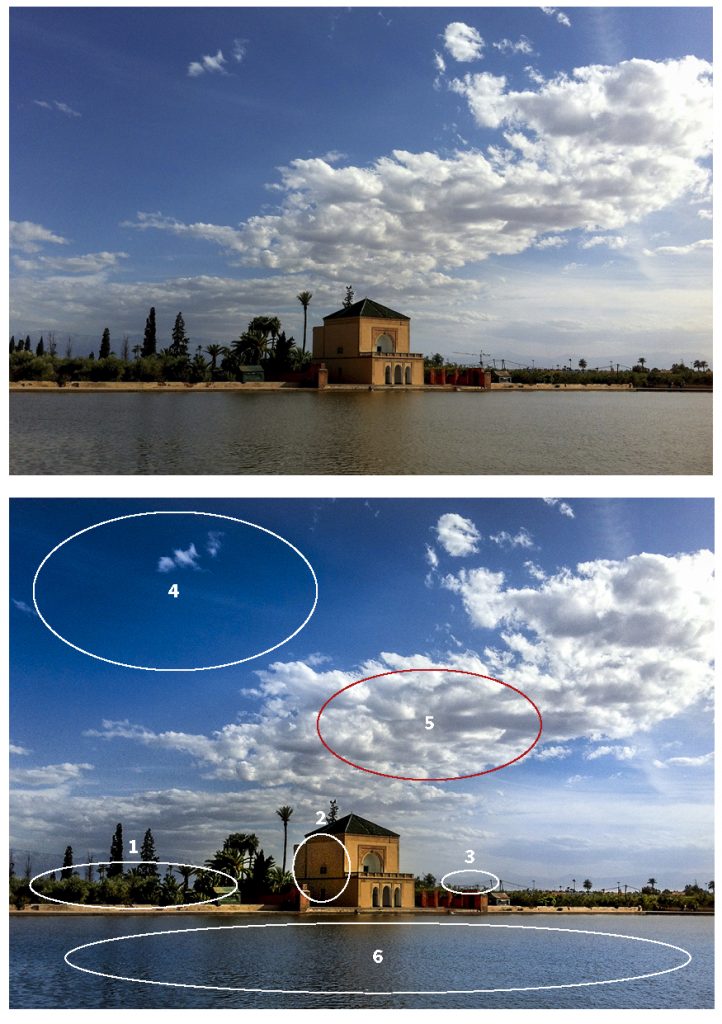
A recent example has been using location pictures from a Royalty Free library. The quality is very mixed due to the content creators being of mixed professional background. Taking some of our high-end scanning and retouching knowledge. A first point can be looking at the details in the horizon line, the point of focus is the edge of the water, so the trees and bushes need to be more defined. The building is rather flat, it is the point of focus of the composition, highlights and mid-tones addressed. The crane on the horizon also lacks the right impression, so removed. Skies evoke so much storytelling, so ensuring an aspirational blue and clouds with contrast and shape, flat of lack-lustre don’t help. Final point, the water needs to reflect the tone of the sky, equally a dirty grey provides no aspiration.

There isn’t a week that goes by, where some of this knowledge is discretely applied to our work. Stuart’s professional development was in this very area; Repro. Ensuring the colour is balanced, points of focus are sharp, retouching is applied to maximise the result. Getting the artwork and imagery right before you print, can really maximise the end result, what goes in, comes out. So why scrimp on your artwork and imaging?


Our Group Of Companies

        Office Equipment Solution  •   Business IT Services  •  Bespoke Print Solutions   •   Technology Repair Services


    We challenge change. We source solutions. We evolve together.


© 2013 - HAD-GROUP.  All rights reserved.