Blog

Keep updated with HAD-PRINT

Maximising your opportunity at Exhibitions and Conferences

So, you’re either planning on exhibiting or have booked to exhibit at a conference, expo, showcase or another great event to get you and your business in front of some great prospects.

However, you want to maximise it, make it work, and create a great memory about you and your business with a potential customer base. The challenges are…

  • The sea of Pull Up Banners all competing to be seen, and nothing breaks the monotony of everyone having the same banners. 
  • How are you making this work with your current marketing? 
  • What are you doing to provoke and create engagement with the audience?

Be different…

  • Use different visual “tools” to be seen
  • Think 3-dimensional
  • Have an activity to engage people
  • Make giveaways relevant
  • Use the space you have and remove barriers to engaging with you.

Add to the journey…

  • Where do you want people to go next within your marketing tools, request a white paper. Become a prospect within your CRM?
  • If needs be map out a pipeline before the event, during the event and post the event with likely actions to support developing prospects into clients.
  • How do you create value by connecting with you? 

Yes, the Pull Up banner might be the staple go-to small exhibition visual tool. However, the commonality of Pull Up Banners means if you want to be seen, thinking differently will help. Breaking up the monotony will make you think about how you dress your stand to add extra points of interest. Easy wins for dressing a stand include branded tablecloths, runners, Tabletop cut-outs or feature graphics. Or even do something fun and engaging!

If you are looking to be different then a Stretch Printed Cloth display system provides a great refreshing change from the Pull-up banner or the Pop-up System. They have more shapes available and equally, add a different dimension to an exhibition space. It is essential to confirm what space you have beforehand and have a plan of how to use the space. Especially as these do occupy a very different space from just banners.

If you are in a small “booth” style pitch at an exhibition, if you have the height – use it! Feather flags might be associated with the outdoors, if you know you’re in a hall with a high ceiling – make the most of it. Just remember the basics of health and safety, and ensure it is safe.

Connecting your marketing: Ideally exhibiting is part of your marketing plan, which links everything together. Ensure you have a great message to connect with the audience you want to connect with. To make attendance at an Exhibition or Conference successful you do need to put in the leg work beforehand. Have you lined up social media content to back up your presence? Have you invited local customers to informally have a chat? Does exhibiting also present the opportunity to provide introductory offers or other onboarding techniques – how do you plan to communicate this, and provide references to accelerate the journey to conversion?

“People like people like themselves.” Understanding the audience at the event is essential. So much communication is done by non-verbal communication, body language signs and the mirroring of behaviours. Before you even start, you can be putting yourself at a disadvantage, be you, people like people. Therefore, if you don’t attire in a three-piece suit – don’t, if your attire is more casual, ensure it matches your personal brand and the brand of your business. Face it, I am well known for distinctive Hoodies, and bright matching trainers, it’s my signature, create your signature which echoes your business’s brand values. It’s a deliberate approach for us to break down barriers by being easy to approach. Branded apparel and workwear can aid in being seen and being remembered – how often in a networking room is it a sea of grey, blues and blacks? (I’ll assure you I am remembered when networking just for my attire)

Once your vibrant personality has caught someone, or equally, you need an opening line to get to talk to someone, an on-stand activity is a great ice-breaker. From simple lucky dips, wheel of fortune, “Play your cards right”, guess the number of sweets in a jar, having a bit of fun is so important, as it provides the opportunity to get to know people.

Which leads to giveaways, or merchandise. Yes, great idea for providing a brand presence for a while after the event with your prospect. However, thinking about this care is essential; Is it useful? Does it have a lifespan which is responsible? – yes, the green-eco agenda is important. Equally if giving away sweets, or other food items, need to think about allergens. Ensuring that your prospect goes away with something different is the key. If you’re just going to use a standard leaflet, remember when it hits the bag, will it stand out? Using unusual shapes, different folds and finishes will add to the look twice aspect. Of course, ensure your print has a measurable Call To Action on it.

Ultimately, what you put into an event will be what you get out of it. Getting the mix, of publicity, presence, and engagement right will help you maximise your return. Delivering your branded message will reinforce your message – just ensure it has a unique memorable hook and you’ll make some inroads to connecting and building great new business opportunities.

Old fashioned values…

There’s not a week that goes by, where we see an example of this. So hence I will try to sanitize this in the essence rather than give examples from seen and witnessed experiences to save blushes from the offenders.

Yes, print has been around for decades and centuries…. however, it is still a craft, which needs the understanding to get the best out of it, dared I say, this is getting forgotten, mislaid and ignored. 

Print exists at a point of delivery in the marketing and communications processes. It is a technical art, which requires knowledge to maximize its performance, and technical efficiencies to create stunning pieces which deliver spot on. What doesn’t help is the race to the bottom, the rising cost of materials in the current economic climate and the lack of understanding of how it works.

True story one… we have seen a set of brand guidelines from a client, rather sparse on meaningful print-related bits, or with minimal print-related colour information. The client on starting the first job mentioned minor issues with colour. We ran the job, needless to say, in different lights, eg morning, and late afternoon the colour shifted and other issues around metamerism, subject to the profile of the light hitting the page. The job returned for a reprint a few months later, picking up on the feedback, we endeavoured to work around and correct the issue. Please note, that the first printing was to their supplied artwork and colour specification breakdowns. We did get it better, however, in rectifying one issue it identified a subsequent issue, with a secondary colour when it sat alongside the key/ predominate colour. So the job returned for a third printing, this time, we ended up requesting agreed satisfactory materials (samples) with the correct colour to the client’s perspective. On cracking open the brand guideline documentation, we then realised the colour under the technical mix (CMYK) breakdowns was different than the specification labelled on it. Shock horror, fully knowing that the client wasn’t going to either care or understand, we needed a way to resolve this. So using the sample, we matched, in neutrally balanced daylight, to a Pantone colour reference guide. This determined the best colour close, which was printable. It was a colour close to the edge of the colour gamut (within the match of reliably printable within a CMYK process). Establishing this allowed us to define how we would tackle the printing of this job.

The moral of the story, is if you are having branding created, and more of it is going to be in physical form than online form, engage a designer that has proven specialisms with print, paint, and signage (all of which are within additive value colour spaces). As the online world uses subtractive colour models or RGB colour spaces. Getting colour right is so essential, understanding colour and how it works is essential to a great delivery of a brand.

True story two: Material specification. Print is wonderful for using many different materials, which provide different stimuli and receptive feelings and emotions for the end user.

However, understanding how these materials perform in a production environment is key. All because it is right for the aesthetics don’t mean it will be right for the budget of the client. The design has and always will be about how something is created for end users and what the end use achieves. Understanding the how is essential, you would not find a cast metal specialist trying to create something out of timber.

A great illustration of this is when a graphic designer specifies a laminate on a disposable giveaway item like a leaflet, equally when the leaflet is also printed on the heaviest weight board going as well. In both instances, it isn’t environmentally friendly, as the resource used for the item is purely for aesthetics only. Design is also about functionality and budget.

Another illustration is a bound job, where a non-folio stock is used as text pages within a bound job. So what is a folio stock? It is best described as a paper weight which works within a binding process. So, using a 170gsm or 200gsm stock as brochure or book leaves on a saddle stitched job, will require every section to be creased, and folded separately to prevent cracking. What is cracking? When using heavier weight stock, an indentation is made in the form of creasing or scoring the substrate to compress or control the fibres of the board in the sheet. When loosely folded, these fibres are still uncontrolled, thus they break the edge of the sheet when folded. So if you have a 20 or 28-page saddle stitched book, every 4-page section will need creasing before folding, gathering and stitching. Point to note different print methods also behave differently when it comes to print finishing. The implications generally are budgetary, as the number of processes often increases the budget. It isn’t common for bindery lines which gather stitch and trim to inline crease printed sections prior to binding. This results in hand collation before stitching, which is removing automation.

Raising on the point above, materials are at the heart of what we do as printers, we work with different substrates every day, and we understand what they will do in production. Being savvy with specifying means being savvy with your budget. 

As print professionals, yes we design artwork pieces for print. However we understand you need creative input on occasions to shift the thinking and presentation, and we applaud you for it, however, bring us on your journey with you. As champagne on lemonade budgets doesn’t help if you cannot afford to properly implement the scheme. 

So who am I to make these comments, with over 30 years in the trade, I’ve handled a vast range of print and moved it through to successful completion. Not only experienced but educated in print (possibly last generation with such a broad experience) so ND in graphic design, with hands-on with different processes and allied work experience whilst in education. Followed by HND in design print management, where my scope, understanding of processes, materials and working practices was homed even further. Subsequent education in the form of a C&G level 3 in photography. Also BPIF Young Manager in Print runner up in 2003. 

In summary, Good design with an understanding of the process is so essential, however, coupled with relevant experience to deliver is challengingly missing from so many. Ask the right questions, see portfolios, and ask for learning points from every example, if they are purely creative, then do you want to engage that designer on your job?

Learning from a day at a major exhibition

Stuart spent his Saturday at the Caravan, Camping and Motorhome Show at the NEC. However, probably spent more time looking at the stands than some of the contents.

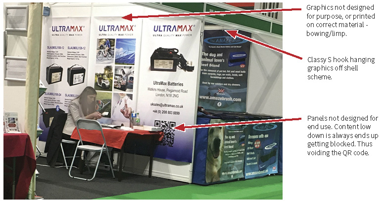
The world of exhibitions certainly has changed. The need is still there, the challenges and environment are very different. However, scrimping isn’t the way forward. Even if you are taking small space, make the most of it. Not like one 3×3 shell scheme where 9 pull up banners and literature stands were rammed, but think through what your message is. Less is more as some say.

Stretched cloth graphic panels at the back.

Big themes are this year’s Caravan, Camping and Motorhome Show were the presence of printed fabric in use for banners and point of sale. Yes at this show the need for built stands is less, so the construction and thought processes and probably different. However, the presence of printed fabrics, not just in hanging fabrics, stretch displays panels, dividers and feather flags, was one trend that showed the shift in trends over the last few years.

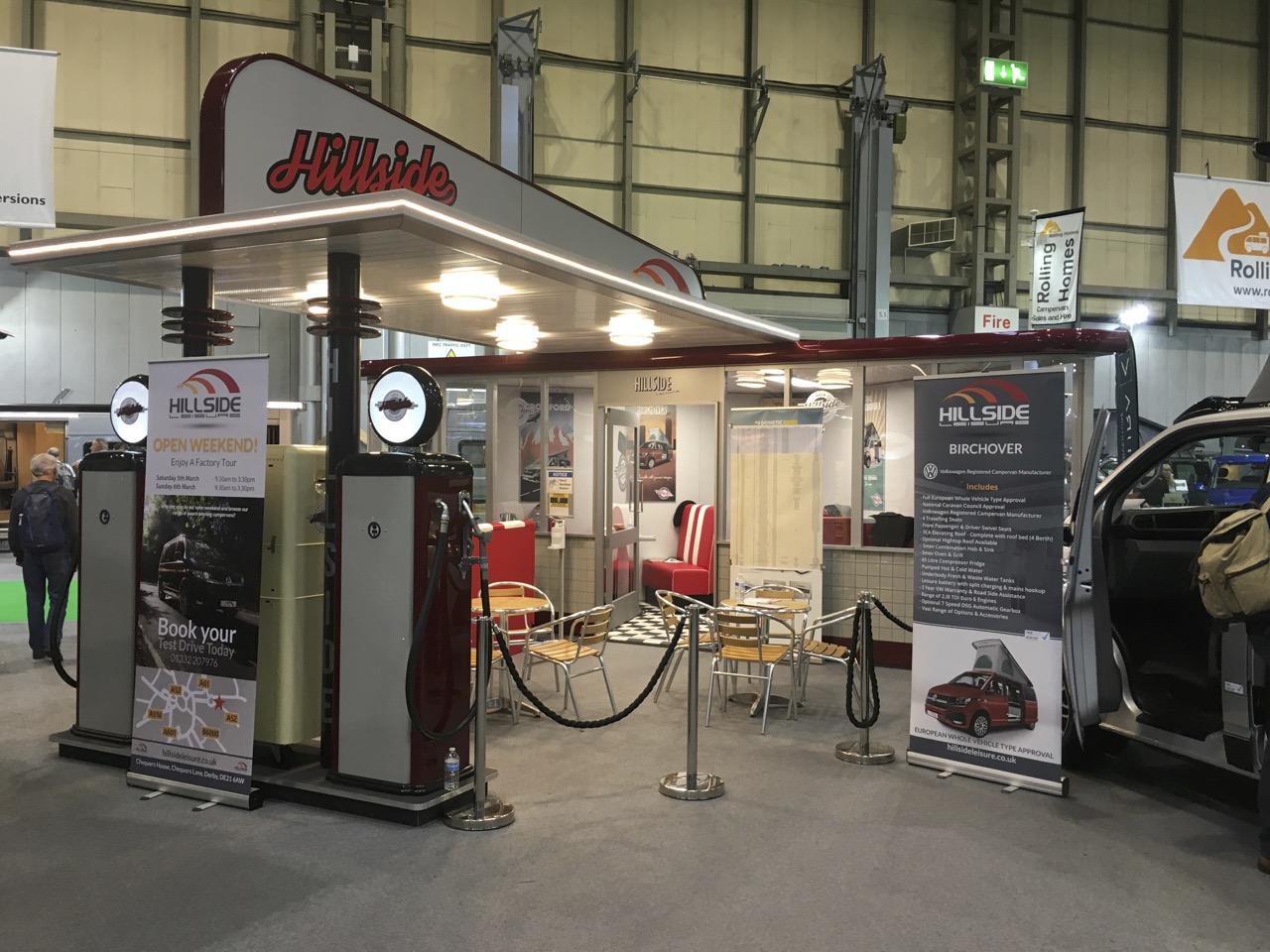
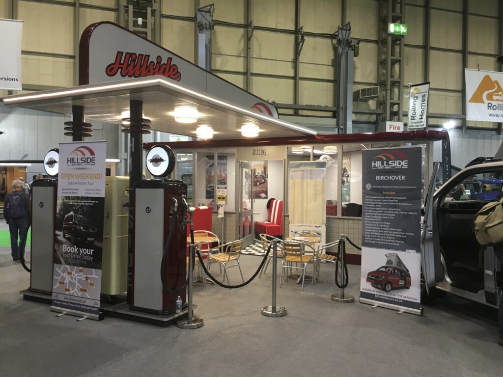
Hillside Leisure certainly created a good impression with this.

The most outstanding one surely goes to Hillside Leisure for its stunning retro-themed stand. Where styling and design can create an impact that sets the tone of your business superbly. Utilising a stand designer to create such immersive visual experiences which tie together your branding, really shows this off as a pedigree in their marketplace. Plus it set the tone for the products, in the form of wonderful motorhomes.

For every highlight, you see cardinal sins against presentation, scruffy scrim banners loosely hanging on shell schemes. Firstly, if this was your business think about first impressions, that’s why you’re at a major show! The 11-second rule applies every time – people seriously make their minds up that quickly if they want to look and talk to you. 

So even if you make a basic floor plan and wall plans and think through what you have, what your messages are and be concise, it’s all about attracting people to your stand! If you have a plan and objectives getting a design professional to input is then easy as this forms the brief. Simple inputs can make a big impression, as one Foundry business we’ve been working with recently has discovered, including materials and ease of doing. 

If you are serious, exploring all the options around exhibiting at events should be considered. Talking to a stand designer like Wayne at Clarke Concepts will stand you in good stead for making informed decisions about maximising your impact and return on investment.

Canny tip… If you are utilising a smaller space nothing is stopping you from using the height to grab attention. A feather flag in these situations is a great tool for the job. Perhaps it goes with the territory with outdoor businesses maximising their display assets, but they worked well indoors, with plenty seen throughout the 5 halls. 

Use of Feather Flags for height.

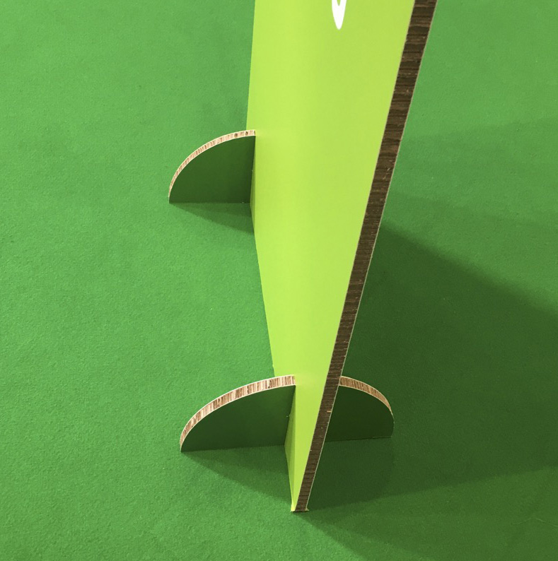
The impact of environmental awareness is slowly creeping in. Great to see show signage now on thick corrugated stock which makes it fully recyclable. However, still, there is a lot more to be done to bring better environmental standards to exhibitions. Especially as some of the build practises need to incorporate more recycling and reuse, as the commercial standards or speed and time is money dictate how things are done.

As with any marketing opportunity like this is a major investment, making sure you get it right is so important. Savvy spending is an essential start if you’re new to exhibiting at events. However, if you’re a seasoned pro, the whole “plan implement review” cycle is still so important. When was the last time you properly reviewed? Things have shifted significantly over the last few years, not just with the pandemic but with technology and trends.

Why partner with us for your exhibition presence? A rounded approach, from stand to collateral and apparel, total solutions. We work with stand designers/builders, marketers, photographers, videographers and a lot more allied trades to bring together a rounded package, which will perform.


Our Group Of Companies

        Office Equipment Solution  •   Business IT Services  •  Bespoke Print Solutions   •   Technology Repair Services


    We challenge change. We source solutions. We evolve together.


© 2013 - HAD-GROUP.  All rights reserved.