Blog

Keep updated with HAD-PRINT

Marketing – Back to basics

Marketing is all about educating your customer about a product or service.

Ask any educational professional about key learning styles or methods and they will talk about Visual Auditory and Kinaesthetic (or VAK).

Over the last decade, we have seen a rush to engage digital technologies for the ease and convenience they bring. However, the rush has made us forget the key premise of how we learn. The engagement from touch, reality, which builds trust, through physically being there is missing. 

The need throughout the COVID-19 pandemic to be still connected heightened the advancement of digital meetings, through zoom, teams and other platforms. We all read each other’s non-verbal language without even realising it, which has been devoid from digital platforms due to only seeing bust upwards of most participants. However, are we missing other communication receptors in this digital advancement? I know from people I have had conversations with, some have experienced zoom-burn-out, with back to back meetings, taxing the individual’s concentration to the max, through constantly staring at a small screen.

Working only with visual and auditory senses, it’s challenged us. When you think that sight is more than a small screen, hearing is more than the immediate speaker on a call. It leaves touch, which when we pick up something, a book, a pen or even a digital device, they are all crafted to evoke reactions. When we meet people we are aroused by the smell from perfume or aftershave or even fabric conditioner, the typical business meeting we’d meet for coffee or something else and we’d remember the taste and flavour of the coffee or the environment we were in. We build a picture of that moment and automatically attach it to the individual, this forming a mental picture and memories, whether favourable or not. 

So are we missing a trick? Is now the time to return to being physical, leading the waive in positively creating memories? Of course, I am biased, I feed of tactile engagements, through my own experiences in print and design. Is it time to arouse the senses?

I am fortunate that I can do things differently, that I am accountable to myself. We have even before the pandemic did engagements via traditional mail, which evoked the senses. Our 2nd birthday being one example, where we partnered with CHIPP Coffee to deliver a cupping experience for our guests. The invitations featured physical real coffee beans inside a tactile (Linen textured board) gatefold (opening out from the centre) invitation. This raised a significant level of interest. Plus, once Royal Mail had processed the mail, they had also gently ground the beans to release some coffee aromas. Over the years we’ve inserted enveloped tea bags, chocolate bars and many other things to play on the wealth of sensory receptors of your audience.

The thinking overall is to think about the total experience, not just the design or the visual. In a world where marketing messages swamp us, the need to be different and pronounced and clear is paramount to achieving better results.

Proofing perfection – get it right first time.

Once upon a time (well that sounds like a children’s story), the process of “proofing” was a critical process of producing an item for print. We are in changing times, and every penny counts in a budget, so a costly mistake can be the last thing you need. In a day and age, where online content is always updated and evolves, sloppiness creeps in. A piece of printed collateral will have a longer life span than a piece of digital content.

It may seem like there is never time to proof something thoroughly the first time, but when it is not done, you may end up making time to do the entire job a second time. Just what are some of the things that should be checked during the proofing process? Here is a list to perfect your proofing strategy:

Proof the textual content.

The first place to start is the text. Review all text for spelling and grammatical correctness, check punctuation, and most importantly, the accuracy of the content. One of my early bosses encouraged us to read the text backwards, so read it properly, then go to the end of the paragraph and check every word. If you have written the text and revised it copiously, get a second pair of eyes to be your critical friend and read it. Good editors/copywriters don’t charge too much for this service.

Check the image quality.

Image quality expectations change vastly with different types, colour is a critical item as well. What might view ok on your computer screen, could reproduce differently in print. An experienced pre-press technician or digital printer will guide you through ensure modest colour management. They will ensure calibration from screen to print and different paper stocks. Worth noting that a screen uses subtractive colour (RGB) and we print using an additive process (CMYK) so colours will vary. For high-level image quality jobs, it may be wise to have physical proof rather than just an on-screen proof, as digital printers, we can proof your job on the paper stock. Or provide benchmarking for colour with standardized materials.

Confirm the overall look and feel.

Pages can look very different on screen to when they are printed. Look over the typography, and the quality of reproduction, ensure you are happy with the detail. Ensure placement of images, illustrations and text. Don’t forget to check hyphenation and line arrangement (as us about Widows and Orphans), page format, and bleeds.

Whilst the print process has dramatically reduced in its timelines, the proofing process is something which you cannot afford to reduce. It is the difference between making a modest impression or an excellent impression with your reader.

How not to specify and design a flyer for a door drop.

Well if only the businesses knew what I did when they dare to deliver tat to my door.

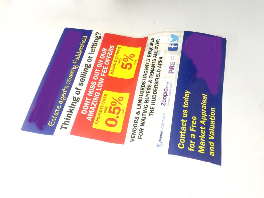
One local estate agent canvassing for business sparked this, a poorly specified and equally un-inspiring single-sided flyer. So, what did they do wrong and what can you do to avoid doing the same mistakes?

1) It was a flyer! Flyers are not a product for door dropping. Flyers are for handing out and inserting into packages. The 130gsm gloss art paper just spanks of being cheap and nasty, which it is. The first thing which I think is they do a cheap and nasty service, so think about the specification, does it match your service or product?

2) Again, the specification let this down, as to get it through a letterbox, it had to be scruffily folded down to a stupidly small size, so again making the item look insignificant or worthless – I’m sure they don’t offer a service which matches or do they?

3) The most significant part of this campaign probably would have been the distribution, even if they had got their cousins’ son to walk the streets, it’s still a big investment in time and money. So why only a single-sided flyer! You have a second side to tell more of your story or provide another call to action point.

4) On scrutiny and a closer eye reading the flyer, there were 4-5 grammatical errors on the page. Yet again, if you are trying to get a high-value ticket sale, attention to detail matters. All these small points matter as your brand is at the heart of the message, if these small points add up, what is the message you are delivering?

So, what could they of done better….
1) Specified and designed correctly. Understanding how something is going to be used and received is essential to get your message across correctly. We don’t just put ink on paper, we ensure you your message right and it sits correctly for you and what you are doing. Using a thin card stock would have been better, equally, they wouldn’t have needed the A5 size, it could have been A6 or DL, which would have equally worked.

2) Relevance, there was nothing relevant about the flyer to me, or to where I was. Huddersfield is a big place, I could be in Holmfirth or Birkby and I would engage very differently to it. So, think about who is receiving it and what’s important to them. No imagery on the flyer created any sense of locality, you state Huddersfield, but you could be in a back bedroom in Leicester for all I know.

3) The offer showed no sign of being time-limited or restricted, so why do I need to act now. The call for action, was a non-call for action, why should I engage now?

We have many more tools for creating empowering engagements with customers. Estate Agents, we can help you more than you think, as we can bring locality, bring data to convince vendors to sell or let. Unfortunately, this Estate Agent was using a scattergun approach, which equally will not result in any significant return. A keyword in marketing is targeting, if you have a target audience, drive messages to them to convince them, the key is them.

So if this agent was feeling like they wanted a campaign which would have returned them good enquiries and leads we would suggest

–           Localisation, bring it down to the area, Almondbury, Netherthong, wherever. If you want to be more specific and the Estate Agent has a pedigree selling in the area, use the street name. This will further engage the recipient, create a value, show respect and understanding of the area and its properties.

–           Use statistics and facts. People like to know if they are going to put their biggest asset on the market, they are doing the right thing. Demonstrate any increase in value for the postcode, which reinforces their hunches. The estate agent needs to demonstrate their ability to sell the property, so the time from going on the market to sale completion. 

–           Use the right product if you are door dropping, you know the areas, what the values are, so be reflective in the product you door drop. Here we can help you with an array of solutions.

How do we do it, we are a digital print house, and thus can vary data on flyers and door drops. Even if they are short runs with specifics, we are set up to manage and control this. 

So don’t be like the un-educated, be smart marketeers, focussed targeting, use relevant products to engage your audience appropriately to create higher levels of engagement. Which result in better enquiries and sales. Start your smart print solutions journey with us.


Our Group Of Companies

        Office Equipment Solution  •   Business IT Services  •  Bespoke Print Solutions   •   Technology Repair Services


    We challenge change. We source solutions. We evolve together.


© 2013 - HAD-GROUP.  All rights reserved.