The lost art of repro
Our Stuart unpacks some of the traditional knowledge when applied to digital print, really packs some punch in creating stunning results.
In an age not that long ago, there was a rare breed of skilled craftsman called Repro Technicians. Usually found in something called Repro Houses, or Prepress departments in reputable print businesses. They had a unique skill set, high-level understanding of colour, making the printed image sharp, understanding the magic of half-tone screens and many more mystical things print-related. They were masters of ensuring that that was given to the press operators allowed them to produce top-notch results on press. A classic case of quality materials provided is indicative of quality out.
As technology evolved, Repro Technicians also did evolve. Grasping colour scanning, this was substantially more than your desktop scanner. With equipment which was tuned with fine optical lenses and sophisticated electronics, this produced results which were often tailored to “High-End Repro”. This entailed ensuring good reproduction in the shadows and highlights, correct colour balancing, bringing out detail in mid-tones, sharpening and lots more finessing of quality photographic images to deliver exceptional results. This knowledge is still applicable even in a totally digital environment.

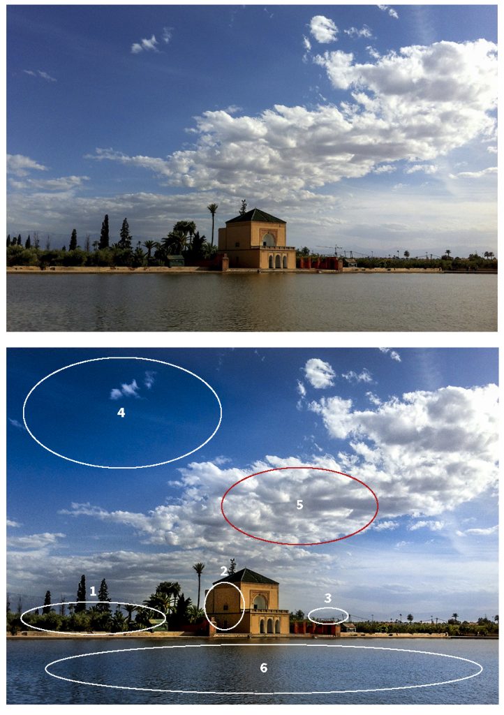
A recent example has been using location pictures from a Royalty Free library. The quality is very mixed due to the content creators being of mixed professional background. Taking some of our high-end scanning and retouching knowledge. A first point can be looking at the details in the horizon line, the point of focus is the edge of the water, so the trees and bushes need to be more defined. The building is rather flat, it is the point of focus of the composition, highlights and mid-tones addressed. The crane on the horizon also lacks the right impression, so removed. Skies evoke so much storytelling, so ensuring an aspirational blue and clouds with contrast and shape, flat of lack-lustre don’t help. Final point, the water needs to reflect the tone of the sky, equally a dirty grey provides no aspiration.
There isn’t a week that goes by, where some of this knowledge is discretely applied to our work. Stuart’s professional development was in this very area; Repro. Ensuring the colour is balanced, points of focus are sharp, retouching is applied to maximise the result. Getting the artwork and imagery right before you print, can really maximise the end result, what goes in, comes out. So why scrimp on your artwork and imaging?


